This set of Bioprocess Engineering Problems focuses on “Graph Paper with Logarithmic Coordinates”.
1. Is the Power law related to the straight line in the log-log plot?
a) True
b) False
View Answer
Explanation: A straight line on log-log graph paper corresponds to the equation:
Y = BxA
In y = In B + A In x
If A is positive, y = 0 when x = 0, If A is negative, when x = 0, y is infinite;
If the log-log graph paper is drawn so that the ordinate and abscissa scales are the same, i.e. the distance measured with a ruler for a 10-fold change in the y variable is the same as for a 10-fold change in the x variable, A is the actual slope of the line. A is obtained by taking two points (X1, Y1) and (X2, Y2) on the line, and measuring the distances between Y2 and Y1 and X2 and X1 with a ruler:
The following data and the graph given is for questions from 2 to 4.
A Lafayette student obtained the following data in the laboratory fermenting yeast to alcohol at 38˚.
| Time(hr) | Cell Conc.(g/ltr) | Glucose Conc.(g/ltr) | Alcohol Conc.(g/ltr) |
|---|---|---|---|
| 0 | 0.882 | 5.14 | 0.00 |
| 0.250 | 0.899 | ||
| 0.500 | 0.883 | ||
| 0.750 | 0.894 | ||
| 1.00 | 0.879 | ||
| 1.25 | 0.936 | ||
| 1.50 | 0.980 | ||
| 1.75 | 1.00 | ||
| 2.00 | 1.04 | ||
| 2.25 | 1.05 | ||
| 2.50 | 1.09 | ||
| 2.75 | 1.13 | ||
| 3.00 | 1.12 | ||
| 3.25 | 1.13 | ||
| 3.50 | 1.14 | ||
| 3.75 | 1.12 | 3.25 | 1.31 |
The Fermentation produced 1000 g of a solution containing 0.13% alcohol.
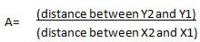
2. From the graph and data given find the below.
i) What is the lag time for the fermentation?
ii) At what point in time does the stationary phase begin?
a) i) 2 hours, ii) 2.75 hours
b) i) 0.5 hours, ii) 3.75 hours
c) i) 1 hours, ii)2.75 hours
d) i) 1 hours, ii) 3.75 hours
View Answer
Explanation: (1) From the graph it appears that the lag time is about 1 hour.
(2) From the graph it appears that the stationary phase starts after about 2.75 hrs.
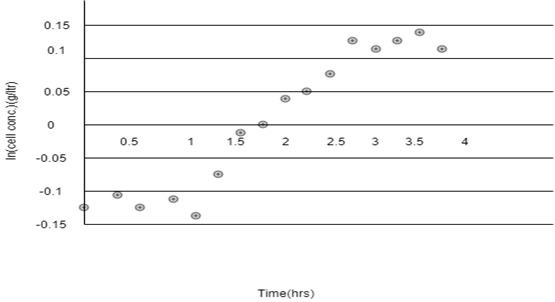
3. Refer to the below graph, determine the specific growth rate µ and the doubling time.
a) (0.118 hours, 5.9 hours)
b) (0.119 hours, 5.9 hours)
c) (0.151 hours, 5.9 hours)
d) (0.119 hours, 5.9 hours)
View Answer
Explanation: The regression results show that μ = 0.118 hr-1. The doubling time,
td = ln(2)/μ
= 0.693/0.118
= 5.9 hrs.
4. Refer to Q2 and Q3 and find out the below.
(i) Calculate the yield of cells on glucose.
(ii) Calculate the yield of alcohol on glucose.
a) (i) 0.124g cells/g glucose, (ii) 0.897g alcohol/g glucose
b) (i) 0.127g cells/g glucose, (ii) 0.694g alcohol/g glucose
c) (i) 0.145g cells/g glucose, (ii) 0.890g alcohol/g glucose
d) (i) 0.126g cells/g glucose, (ii) 0.693g alcohol/g glucose
View Answer
Explanation: (i) Yield of cells on glucose = -Δ(conc. cells) / Δ(conc. glucose)
= -(0.882-1.12)/(5.14-3.25)
= 0.126 g cells/g glucose .
(ii) Yield of alcohol on glucose = – Δ(conc. alcohol)/Δ(conc. glucose)
= -(0.00-1.31)/(5.14-3.25)
= 0.693 g alcohol/g glucose.
5. Which of the following is correct to bacterial growth curve?
a) Representation of the asexual reproduction of the bacteria
b) Representation of the sexual reproduction of the bacteria
c) Representation between sexual and asexual reproduction of bacteria
d) Representation of the mutation of the bacteria
View Answer
Explanation: The representation is of the Bacterial growth which is the asexual reproduction, or cell division, of a bacterium into two daughter cells, in a process called binary fission. Providing no mutational event occurs, the resulting daughter cells are genetically identical to the original cell.
6. Bacillus cereus divides every 30 minutes. You inoculate a culture with exactly 100 bacterial cells. After 3 hours, how many bacteria are present and what is the generation number and time?
a) (24,000), (3 generations), (30 minutes per generation)
b) (64,000), (6 generations), (30 minutes per generation)
c) (24,000), (6 generations), (60 minutes per generation)
d) (64,000), (3 generations), (60 minutes per generation)
View Answer
Explanation: Number of cells:
In 3 hours, B.cereus will divide 6 times. Therefore, n=6.
26 = 64 or 2 × 2 × 2 × 2 × 2 × 2.
100×64=64,000cells.
Number of generations:
Number of generations = [log (cells at the end of incubation)]-[log (cells at the beginning of incubation)]/0.301.
Therefore, [(log 6400) – (log 100)]/0.301 = (3.81-2)/0.301 = 6 generations.
Generation time:
60 min×3 hours / 6 generations = 30 minutes per generation.
7. In below mentioned options which one defines correctly the semi-log graph?
a) 10-cycle semi-logarithmic paper
b) 6- cycle semi-logarithmic paper
c) 2- cycle semi-logarithmic paper
d) 1- cycle semi logarithmic paper
View Answer
Explanation: In one-cycle semi-logarithmic paper, the vertical scale goes from 1 to 10 and within the One order of magnitude (101) whereas, in others the magnitude varies like in 2 – cycle there is the magnitude of two i.e. (102) and likewise other options have different magnitudes according to their number of cycles.
8. Estimate the correct straight line in the log-linear scale?
a) (If the population is growing exponentially, the curve will be concave up), (If the growth is slower than exponential, you will see a straight line), (If the growth is faster than exponential, the curve will be concave down)
b) (If the population is growing exponentially, the curve will be concave down), (If the growth is slower than exponential, you will see a straight line), (If the growth is faster than exponential, the curve will be concave up)
c) (If the population is growing exponentially, you will see a straight line), (If the growth is slower than exponential, the curve will be concave down), (If the growth is faster than exponential, the curve will be concave up)
d) (If the population is growing exponentially, you will see a straight line), (If the growth is slower than exponential, the curve will be concave up), (If the growth is faster than exponential, the curve will be concave down)
View Answer
Explanation:
Functions plotted on the linear scale:
Figure 1:
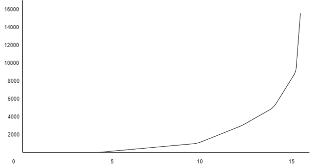
Figure 2:
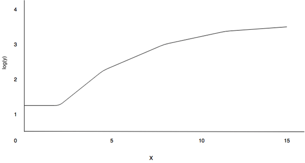
Functions plotted on the log-linear graph:
Figure 3 :

Figure 4 :
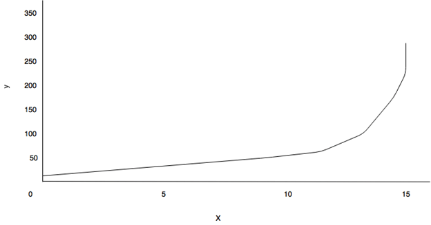
From the above graphs mentioned, Figures 2 and 4 grows exponentially while the function in Figures 1 and 3 grows slower than exponentially since the curve is concave down.
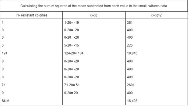
9. What are the mean values of each given data set?
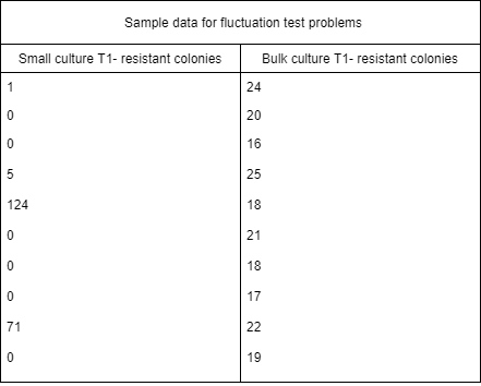
Mean values: (Small culture, Bulk culture)
a) (19.0,20.0)
b) (20.0,19.0)
c) (20.0,20.1)
d) (20.1,20.0)
View Answer
Explanation: MEAN-
Small culture-
For parallel series of small cultures, the sum of T1-Resistant colonies is:
1+0+0+5+124+0+0+0+71+0 = 201
The mean value is then calculated as the sum divided by the numbers of measures taken: \(\frac{200 \,T1-Resistant \,colonies}{10 \,samples}\) = 20.1 T1-Resistant colonies/sample
Bulk culture-
For the samples taken from the 10-ml bulk culture, the sum of T1-Resistant colonies is:
24+20+16+25+18+21+18+17+22+19 = 200
The mean value is then calculated as this sum divided by the number of samples taken:
\(\frac{200 \,T1-Resistant \,colonies}{10 \,samples}\) = 20.0 T1-Resistant colonies/sample
10. Refer to Q9 and calculate the variance of each data set?
a) (1239,8.0)
b) (1823,8.9)
c) (8.9,1823)
d) (8.0,1239)
View Answer
Explanation: In variance there is small culture and bulk culture.
Small culture-
The sum of values in the (X-x̅)2 column = Ƹ(X-x̅)2 = 16,403
Since there are 10 samples in this data set, n=10. Placing these values into the formula for calculating the variance yields,
Variance = \(\frac{Ƹ(X-x̅)^2}{n-1} = \frac{16.403}{10-1}\)
= \(\frac{16.403}{9}\)
= 1823
Bulk culture-
The sum of values in the (X-x̅)2 column = Ƹ(X-x̅)2 = 80
Since there are 10 samples in this data set, n=10. Placing these values into the formula for calculating the variance yields,
Variance = \(\frac{Ƹ(X-x̅)^2}{n-1} = \frac{80}{10-1}\)
= \(\frac{80}{9}\)
= 8.9
11. The manipulated variable levels Continuous (i.e. time in years) or Clumped into groups( i.e. 0-5 years, 6-10 years) is represented as _________
a) Continuous- Scatter plot/line, Clumped- Histogram
b) Continuous- Histogram, Clumped- Scatter plot/line
c) Continuous- Pie chart, Clumped- Scatter plot/line
d) Continuous- Pie chart, Clumped- Histogram
View Answer
Explanation: HISTOGRAM :
Histograms are similar to bar graphs except the data represented in histogram is usually in groups of continuous numerical (quantitative) data. In this case, the bars do touch. Histograms are often used to show frequency data.
Example- Average mean temperature between the years 1900 and 2000
SCATTER- PLOT:
The points are plotted on the grid, but they are not joined point to point. A best fit line may be added to a scatter plot to show a trend. Line graphs are only used when both variables are quantitative. These graphs are useful for showing if a correlation exists between two variables, especially when it is not possible to alter either of the variables (i.e. in descriptive studies).
Example – Reaction rate at various enzyme concentrations.
12. On which plot the Best fit-line is represented?
a) Histogram plot
b) Scatter plot
c) Probability plot
d) Dot plot
View Answer
Explanation: A line of best fit (or “trend” line) is a straight line that best represents the data on a scatter plot. This line may pass through some of the points, none of the points, or all of the points.
13. From the following table which one is the dependent and independent variable and what type of graph would you choose for this data?
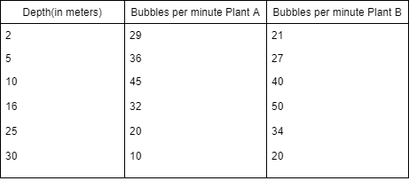
a) Dependent – Bubbles per minute Plant A, Independent- Bubbles per minute Plant B, Graph- Pie chart
b) Dependent – Depth (in meters), Independent- Bubbles per minute Plant A, Graph- Line plot
c) Dependent – Depth (in meters), Independent- Bubbles per minute Plant B, Graph- Line plot
d) Dependent – Bubbles per minute Plant A and Plant B, Independent- Depth (in meters), Graph- Line plot
View Answer
Explanation: Dependent variable-
Bubbles per minute – the amount of bubbles produced will depend on how deep the plant is in the water. The variable that DEPENDS on another variable is the dependent variable.
Independent variable-
The depth in meters – you are controlling the depths at which you place the plants and observing what happens to the number of bubbles. Typically the variable you have control over is the independent variable.
Graph-
Line – we are measuring the change in bubble production over time. (Why not a bar? – There are some gradual changes that may be lost depending on our scale. Also, lines are often more simple to read and less confusing).
Sanfoundry Global Education & Learning Series – Bioprocess Engineering.
To practice all areas of Bioprocess Engineering Problems, here is complete set of 1000+ Multiple Choice Questions and Answers.
If you find a mistake in question / option / answer, kindly take a screenshot and email to [email protected]
- Check Bioprocess Engineering Books
- Apply for Biotechnology Internship
- Check Biotechnology Books
- Practice Biotechnology MCQs